The Njuru
brand at a glance.
A short reference for anyone making something with the Njuru name on it. Treat it as a starting point, not a constraint, and reach for hello@njuru.com when in doubt.
Print or save
The page below is print-formatted. Click Download brand guide to save a clean PDF copy via your browser, or use the download links at the bottom for individual assets.
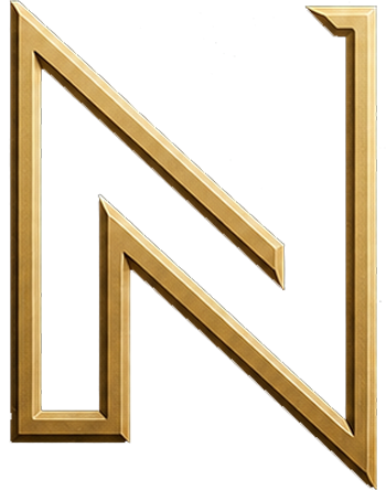
An inscribed monogram. A diamond rule.
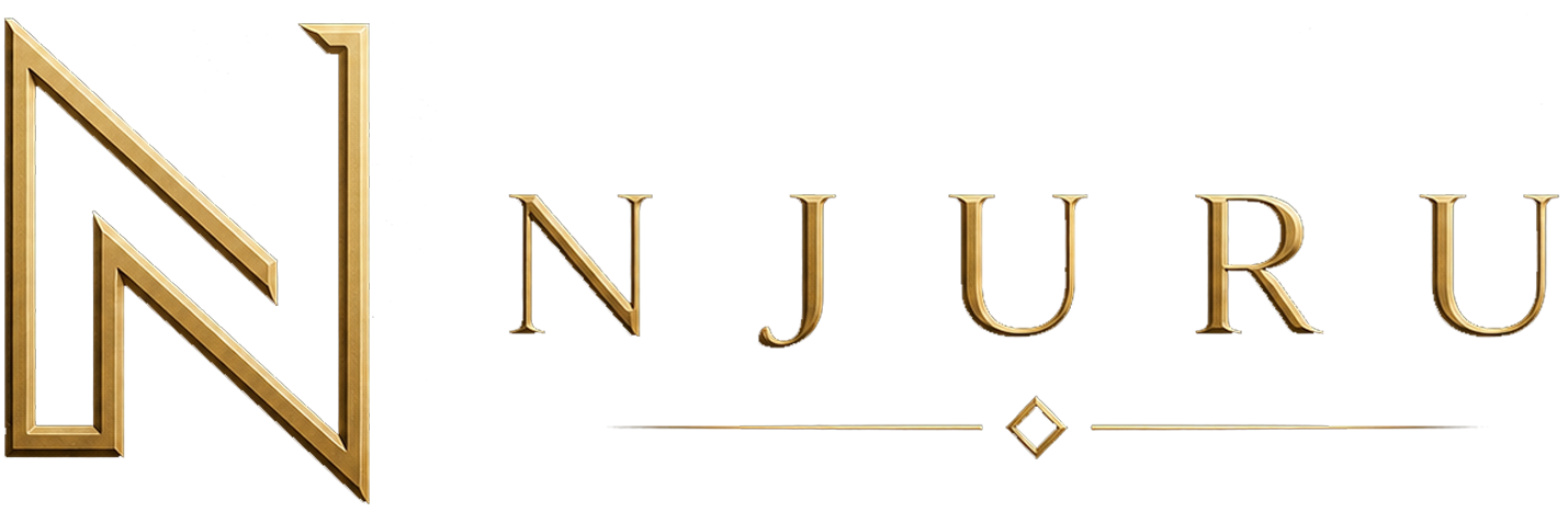
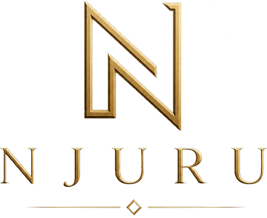
The Njuru mark is an inscribed metallic-gold “N” monogram, paired with a Roman-capital wordmark and a small diamond cartouche. Together they read as something earned and engraved, jewelry, not a sticker. The mark works equally on cream paper or deep forest backgrounds; its golden surface carries its own light.
The four lockups
Use the lockup that fits the surface. The Landscape lockup is the default for headers and most horizontal placements. The Portrait stack is for square or vertical formats. The Icon alone is used at small sizes (avatars, favicons). The Wordmark alone is used when the icon would compete with another mark in the same composition.

Clear space
Maintain a margin around the lockup equal to the height of the “N” monogram. The mark should never sit closer than that to type, edges, or other marks. When in doubt, leave more space.
Surface
The mark’s metallic gold treatment is its identity. Place it on deep forest, cream paper, or a quiet photographic surface where the gold can catch light. Avoid busy photography, gradients that compete, and surfaces that fight the gold tone (cool blues, hot pinks).
Don’t
- Don’t recolour the gold fill or replace it with a flat tone.
- Don’t remove or alter the diamond divider in the wordmark.
- Don’t stretch, skew, rotate, or apply 3D effects.
- Don’t place the mark on busy photographic backgrounds without a darkening overlay.
- Don’t recreate the wordmark in a different typeface.
An engraved Roman capital, in gold.
The wordmark is a custom inscribed Roman capital treatment with subtle bevelled highlights, finished in metallic gold and centred above a slim divider with a diamond cartouche. The result reads as engraving on metal, precise, unhurried, and unmistakably ours. The wordmark is delivered as a finished asset, not as live text. To use it, place the wordmark PNG; do not retype “NJURU” in another typeface.
/brand/njuru-words.png
Forest, brass, and a little restraint.
The Njuru palette is built around three families: a deep forest base (the brand colour), a warm brass family (the accent, used sparingly to feel earned), and a cream paper for light mode. Aurora green is a quiet secondary accent reserved for status pulses and short-distance gradients.
Primary brand colour. The base of every dark surface.
rgb(22, 42, 37)
Background floor on dark surfaces. Adds depth.
rgb(10, 22, 18)
Card surface in dark mode. Catches light.
rgb(26, 46, 41)
Primary accent. Used for highlights, dividers, and the brand’s warm heart.
rgb(194, 157, 79)
Pale brass. Headline gradient terminus and chip text on dark.
rgb(229, 206, 147)
Highlight terminus on the moving gold strip and gradient peaks.
rgb(255, 246, 220)
Secondary accent. Mint-emerald glow used sparingly for status pulses.
rgb(4, 120, 87)
Light-mode page surface. Warm off-white.
rgb(250, 252, 250)
Body type on light. Soft black with green undertone.
rgb(28, 43, 38)
Four typefaces, played in narrow lanes.
Every typeface has one job. Mixing the lanes weakens the system, so we don’t. All four are free Google Fonts.
Building things that aim to be useful.
Hero titles, section headings, editorial moments. High-contrast didone, used at weight 500-700 for elegance with strong silhouettes.
The licensed Roman-inscriptional typeface used for the "NJURU" wordmark. Designed by Adrian Williams and published by Club Type. The wordmark is delivered as a finished gold PNG asset; never re-typeset live, and never substituted with another typeface.
A small holding company building thoughtful digital ventures, with care for the people who use them.
Paragraph copy, navigation, buttons, form fields. Loaded at weights 300-700; default body is 400 with slightly larger line-height for editorial readability.
BUILT FOR REAL USE · QUIETLY HELPFUL
Eyebrow chips, captions, technical labels, and metric stats. Set in uppercase with wide letter-spacing for editorial gravitas.
Quiet. Considered. Honest.
The Njuru voice is the same voice we use with people we respect: warm, plain, unhurried. We’d rather sound like someone you’d be glad to sit next to on a train than someone shouting at you from a billboard.
We assume the best of the people we’re writing to. We choose words that feel hospitable, not transactional.
Clarity is a kindness. We avoid jargon and slogans, and we explain what something is before we ask anyone to care.
We write as though we have time to be understood. No urgency tactics, no growth-hacked guilt, no countdown timers.
We acknowledge limitations openly. If a tool can’t do something, we say so. If a number is uncertain, we say so.
Tone is conversational and unhurried. We rarely use exclamation marks. We let the work speak first.
Yes & no
We say
- “We’d love to hear what you’re working on.”
- “A small team building thoughtful tools.”
- “Made with care.”
- “If you have a question, please write.”
We avoid
- “Revolutionary,” “game-changing,” “disruptive.”
- Exclamation marks (use sparingly).
- Urgency tactics: countdown timers, fear-of-missing-out.
- “Solutions” as filler. Say what the thing actually is.
The Njuru group.
Njuru is the parent. Each venture has its own product voice, but they all sit inside this brand system and share its mark, palette, and type.
- Njuru LLC , www.njuru.com
A limited liability company. The parent company of the Njuru group. Parent company. Owns the digital ventures listed below and operates them as a single, considered family of companies. - Techno Optics , www.technooptics.com
A subsidiary venture of Njuru LLC. Our digital studio. Software, design, growth, and the patient work of making things useful, for the projects we build and a small number of external partners. - Advottic , www.advottic.com
A subsidiary venture of Njuru LLC. A gentler way to build a legal case. Helps people prepare and organize their legal case, especially when they are facing the system without a lawyer. - Taxottic , www.taxottic.com
A subsidiary venture of Njuru LLC. Plain-language tax forecasting and planning. AI-assisted guidance that explains itself, with a privacy-first approach to your numbers. - Rolls & Digs , www.rollsanddigs.com
A subsidiary venture of Njuru LLC. A pocket drag-strip and digital garage for drivers. Solo runs, head-to-head matchups, and a build history for the cars you have loved.
Family marks
Each venture carries its own mark. Treat them with the same care you would the parent: don’t recolour, don’t recreate in another typeface, and give them clear space. As more ventures publish their marks, they’ll appear here.
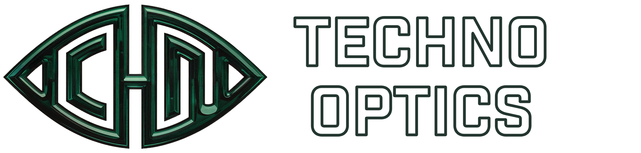
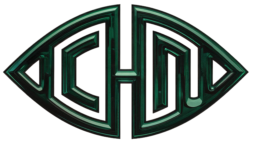
Our digital studio. The Techno Optics mark is a metallic-green inscribed monogram bordered by a clean white stroke, paired with a sans-serif wordmark. The white stroke lets it sit cleanly on cream paper or deep forest backgrounds.

A gentler way to build a legal case. The Advottic mark is a balanced wordmark with an inscribed monogram, finished in white for use on dark surfaces.
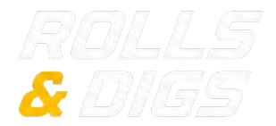
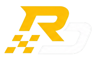
A pocket drag-strip and digital garage for drivers. The Rolls & Digs mark pairs a stylized RD monogram in racing yellow with a checkered-flag motif, alongside a stacked italic wordmark. The identity reads loud, fast, and unmistakably for the track.
Files you can grab.
The most current logo and favicon files are linked below. All assets are available under our standard usage permission, please don’t modify the mark.
- Landscape lockup, icon + wordmark (PNG)/brand/njuru-landscape.png
- Portrait lockup, icon stacked above wordmark (PNG)/brand/njuru-portrait.png
- Icon only, N monogram (PNG)/brand/njuru-icon.png
- Wordmark only, NJURU + diamond (PNG)/brand/njuru-words.png
- Favicon (SVG)/favicon.svg
- Favicon (PNG)/favicon.png
- Techno Optics, horizontal lockup white (PNG)/brand/ventures/technooptics-full.png
- Techno Optics, icon with white stroke (PNG)/brand/ventures/technooptics-icon.png
- Advottic, full lockup white (PNG)/brand/ventures/advottic-full.png
- Advottic, icon only (PNG)/brand/ventures/advottic-icon.png
- Rolls & Digs, stacked wordmark (PNG)/brand/ventures/rollsanddigs-full.png
- Rolls & Digs, RD icon (PNG)/brand/ventures/rollsanddigs-icon.png
Questions, requests, or anything that needs a human eye? hello@njuru.com.
Brand guide v1.0 · Last updated April 2026 · For permissions and trademark questions: legal@njuru.com.